November 30th, 2024
6 Best Data Visualization Courses to Take in 2024
By Alex Kuo · 9 min read
Give someone a data visualization tool and they can impress during a presentation. Teach that person about visualization techniques and you open up a brand-new world where they can draw crucial insights from datasets for years to come.
Enter the six courses we’ll introduce here. Each exists to teach data visualization skills to professionals ranging from data scientists to salespeople and how to demonstrate what their datasets show.
Why Is a Data Visualization Course Worth It Today?
The simple answer is that understanding the visualization techniques that help you connect data dots to draw out insights is an increasingly valuable skill. Globally, the data visualization market is set for tremendous growth. A compound annual growth rate of 7.8% will double the market’s value between 2023 and 2032, taking it from $3.9 billion to $7.8 billion.
Demand for expertise in data visualization tools and concepts will be the natural result of that growth. You have an opportunity to position yourself as somebody who can extract nuggets of insight from complex datasets if you take the time to learn how to use these tools.
What 6 Data Visualization Courses Are Worth Considering?
Knowing that data visualization software exists is just the start. You have to know how to use it to create data visualizations. Enter the six best data visualization courses that combine to teach you a high-demand skill:
1. CareerFoundry’s Data Visualization with Python
2. SpringBoard’s Data Analytics Career Track
3. Coursera’s Overview of Data Visualization
4. Google’s Share Data Through the Art of Visualization
5. PwC’s Data Visualization with Advanced Excel
6. EdX’s Data Science: Visualization
CareerFoundry’s Data Visualization with Python
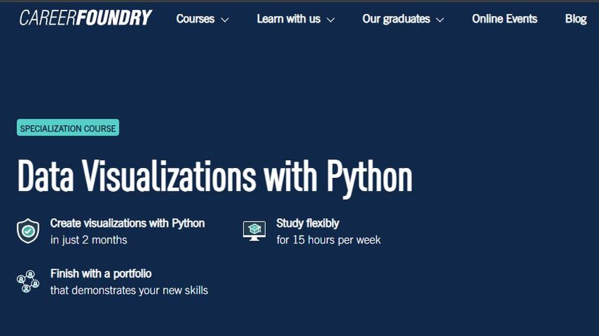
For around $2,000 and a two-to-four-month commitment, CareerFoundry delivers a course showing you how to use one of the world’s most popular programming languages to visualize data. Dedicating yourself to 40 hours of learning per week sees you complete the course in two months. You can also take a part-time approach of 20 hours per week to wrap up in four months.
Dashboard creation, visualization creation, and pulling data from the web using application programming interfaces (APIs) fall under this online data visualization course’s remit. There’s even a job guarantee. If you don’t get a job within six months of completing the course, CareerFoundry refunds your entire course fee.
SpringBoard’s Data Analytics Career Track
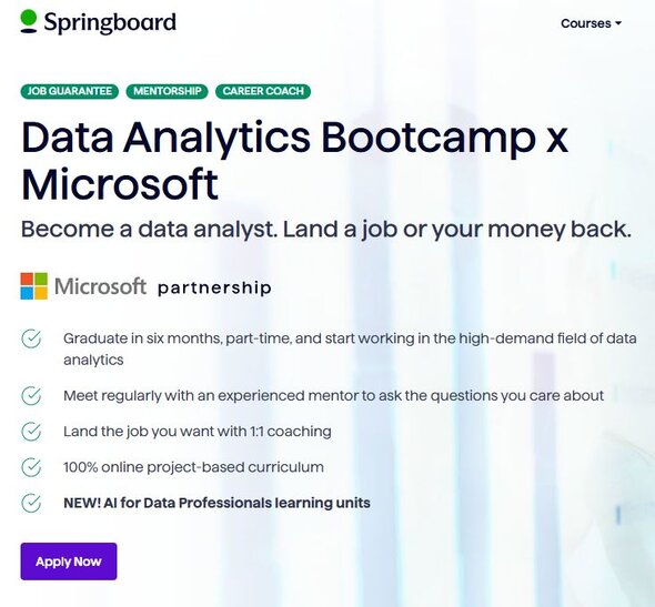
Springboard’s course is much more expensive than CareerFoundry’s, landing between $8,500 and $11,300. It’s also a little more intensive. Expect six months of 20-to-25-hour study weeks once you commit. But it’s worth it. The Data Analytics Career Track course offers comprehensive lessons and one-to-one mentoring both from data visualization industry professionals and career specialists who can help you get a job with your new certificate.
You’ll learn the fundamentals of data analysis with this course, as well as how to use SQL and Python to visualize data. Therein lies an issue for some – this course isn’t purely about learning data visualization. You may want to steer toward a more visualization-intensive course if you’ve already got a solid grip on data analytics and fundamentals. For everyone else, SpringBoard’s course walks you through some vital foundational concepts before it gets to the fun stuff.
Coursera’s Overview of Data Visualization
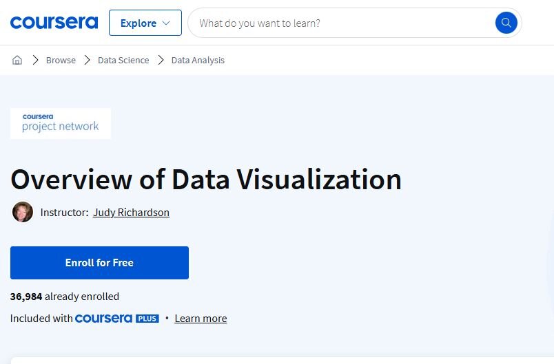
Simple is the name of the game with Coursera’s “Overview of Data Visualization” online course. It doesn’t dive too deep into visualization techniques. Instead, you’re getting more of a primer with a 1.5-hour course that teaches the fundamentals and gives you a foundation from which you build by taking more advanced courses.
The course is almost entirely practical. You’ll discover why data visualization is so important and run through processes for charting data using Google Sheets, which is a free app available to all. It’s free and gives you an opportunity to learn some basics at your own pace.
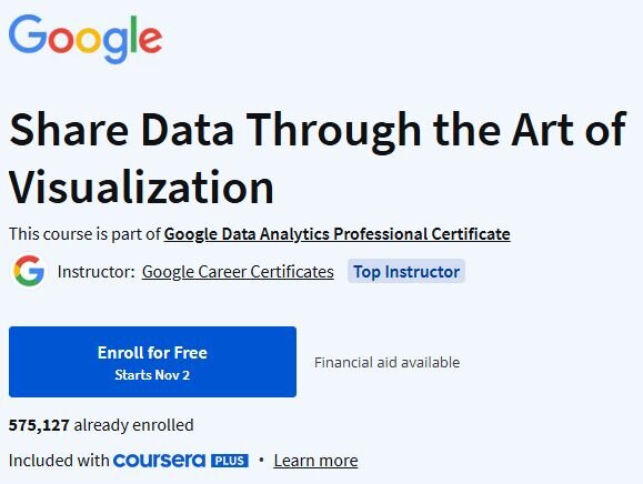
Google’ Share Data Through the Art of Visualization
Another self-guided course targeted at beginners, “Share Data Through the Art of Visualization" is more in-depth than Coursera’s offering. You work at your own pace through four modules. Google says to expect to spend 25 hours running through the materials, though the actual time varies depending on your capabilities.
As for the modules, they focus on building narratives with datasets. That starts with learning why data visualizations are as impactful as they are. From there, you’ll learn how to build data-driven stories using the Tableau data visualization tool. The course wraps things up by showing you how to incorporate your newly acquired visualization techniques into professional-standard presentations and dashboards.
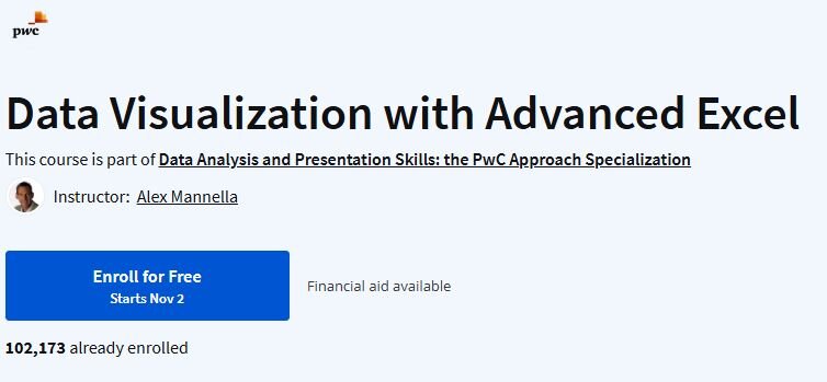
PwC’s Data Visualization with Advanced Excel
If you’ve got more of a business mind about you, PWC’s course is geared towards helping you with learning data visualization for the corporate setting. Excel is the superstar of this course. A crash course in Microsoft’s app takes you from beginner to advanced spreadsheet creator, all with a focus on developing data models and databases. The lessons become more advanced from there. You’ll discover a trio of analytical methods you can use on your Excel spreadsheets and how to use those methods to visualize data. Add a crash course on effective dashboarding to the mix and you get a course that’s ideal for in-company data visualization projects.
Like many of the courses in this list, you’re encouraged to learn at your own pace. Choose this course if you want to get a better handle on the true potential of Microsoft Excel.
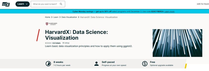
EdX’s Data Science: Visualization
Cheap, cheerful, and requiring minimal commitment. Those are the perks of EdX’s “Data Science: Visualization” course. A flat fee of $149 delivers a course with a recommended time commitment of between one and two hours per week for eight weeks. It’s self-paced, though, so you can burn through the whole thing in a day or two if you want.
The course hones in on ggplot2, which is a data visualization tool used in R, to teach the basics of visualization and exploratory data analysis. You’ll also get to grips with some simple practical datasets as part of your coursework. A certificate delivered at the end showcases completion, though you can opt not to get this certificate and take the course for free.
Make Data Visualization Practical (and Simple) with Julius AI
Learning data visualization techniques may just be your key to jumping onto a new career track in a growing industry. The courses we’ve highlighted here can all set you on your way, whether that means delivering some foundational knowledge or showing you how to craft visualizations using Excel, Python, and similar tools.
Of course, none are effective unless you have the right tool at hand. Enter Julius AI – the perfect tool for analyzing your data and gathering expert-level insights in seconds. Julius empowers you to chat with your files so you understand what the data they contain is telling you. Fast-track your data visualization experience and build on what you learn from these six courses with Julius AI. Try it today.
